The Genetic Makeup of the Great American Race
TLDR
The average modern American has an admixture that is roughly 40% British/English, 20% Irish, 25% broadly West European (N French and W German), and 10% Scandinavian. There are many ethnic enclaves throughout the country who break from this pattern, including Amish, Irish, Mennonite, Mormon, Arcadian/Cajun, Nuevos Mexicanos, and Appalachians. White Americans, on average, have almost no non-White admixture, including from Jewish, African, or Asian sources.
Background
Yes, “American” is a race, or rather, a family of smaller races which find their origins among Enagland and Wales, Scotland, Ireland, France, Germany, Denmark, and Norway. There are other populations in the United States today, but I will be focusing on the American race.
From the earliest times, the American race has been a mirror of Western and Northern Europe in the New World. A proposed seal for the United States, drawn in 1776 by Pierre du Simitière, is shown below, which shows the six nations which were taken as the origin of the colonial American population: England (and Wales), Scotland, Ireland, France, Holland, and Germany. As we will see, this characterization is accurate. Some people will try to convince you that America was an Anglo-Saxon ethnostate before Germans, Irish, and Italians moved in. This is not true. Britain has, however, always been the largest substrate for most of the population.
The genetics paper this article is drawing data from is “Clustering of 770,000 genomes reveals post-colonial population structure of North America” by Han et al, published in Nature on Feb 7, 2017. These researchers took 769,444 DNA samples from Ancestry.com data; 96% of the people sampled had ancestors who were born within the US. From this dataset, we get a canvas showing the large swaths of White American population movement surrounded by a smattering of niche genetic groups across the continent, including Caribbeans, Acadians, and Mexicans. On Ancestry.com, you can also set your ‘pedigree’, or the locations your ancestors were born. This is a great help, because we can now identify the movement of people over time, not simply where they are now. All data and figures in this writeup come from this paper or its supplementary material. Most samples are from California, followed by New York and Texas.

This study traces ‘identity-by-descent’ (IBD) data to create their genetic clusters. An IBD analysis tracks DNA segments that are not merely similar, but are descended from the same ancestor. This is a sample of how clusters are calculated across individuals in this sizeable dataset. This method works best for populations that are not relatively diverse and in which one segment of the genome can occur within numerous participants, which would show descent from a common ancestor within recent generations. Testing between two random Americans is not ideal, since for the last few centuries barriers to mating have been very low, but this dataset overcomes this through its sheer size, and the researchers are able to perform this analysis nonetheless.

Genetic Affinities
First let’s inspect the genetic affinities between groups, starting with the PCA distribution. Below we see participants grouped into states and mapped based on genetic similarity. For the non-initiated, distance in this graphic roughly represents total genetic distance between populations. You can see that California, New York, and Texas are largest, followed by PA, MI, and IL, etc. The far Northeast and the Deep South both form highly differentiated clusters (ethnostates?) forming two ends of the spectrum. The Mid-Atlantic and Upper South cluster closer to the West of the country. We can already see historic movements: notice that Utah is close to New York, a remnant of Mormonism’s origins in upstate NY before moving out west. See how the French of Louisiana drag their state towards the French Canadians of New England. These clusters will color all future maps in this paper.

The primary map is below, the one which merits reposting again and again. The DNA data clusters into the groups shown above, which are then color-coded here based on genetic similarity only, not geographic origin. Those groups are the American sub-races. But what does this graphic show? There are three things going on with each dot: color, size, and location. The dot does not represent a participant in this study, but rather the participant’s parents or other ancestors. Each dot’s location show the participant’s parent’s birthplace. Size indicates the number of birth locations reported for that area. Color represents the nearest genetic cluster which participants from that area associate with. So if you’re DNA clustered with the blue datapoints, you would likely be from Pennsylvania, if yellow, likely from the coastal South. Also, dots are only counted when their OR is above a threshold value, giving the appearance of a mostly empty West.
Alongside that larger map is another showing smaller clusters or sub-races which the researchers picked up in finer detail. See: American blacks, Mormons, New York Jews, Amish, and Appalachistanis, etc.
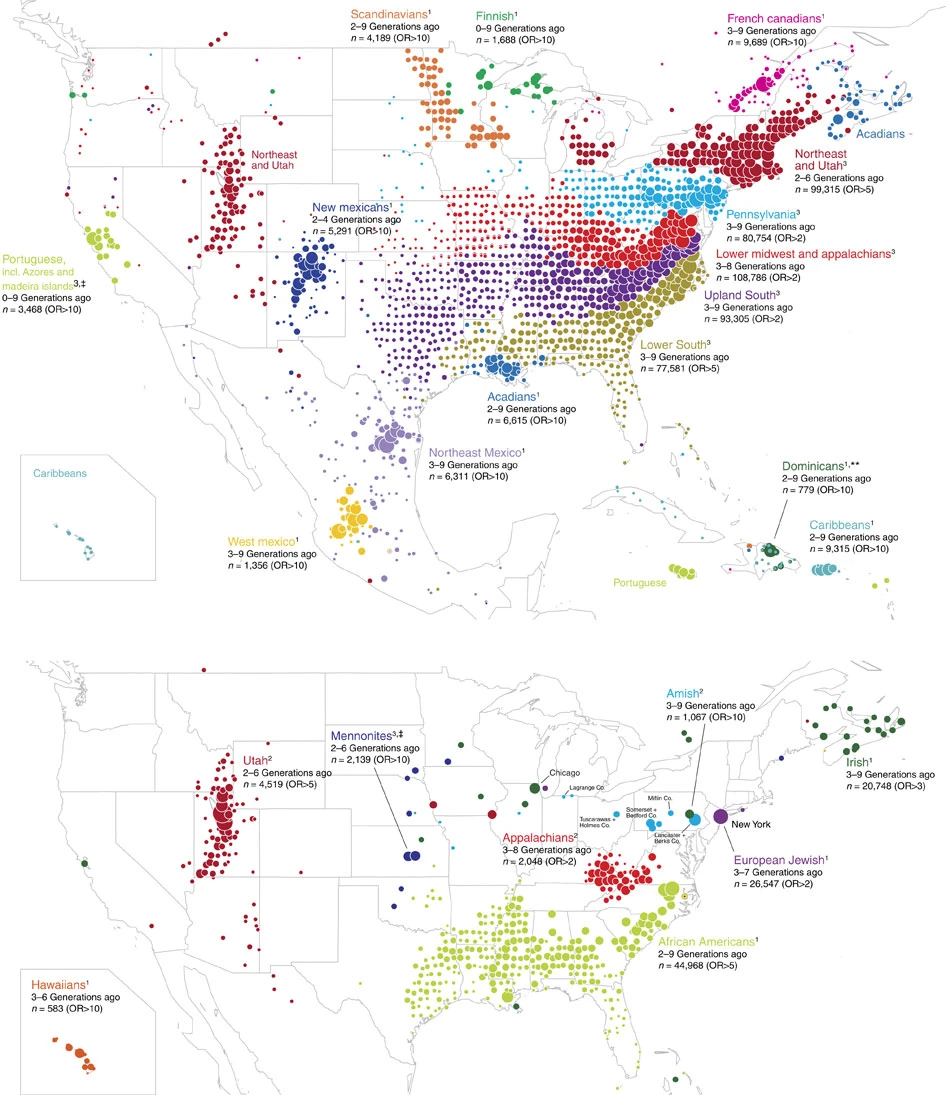
There we have it: the five largest genetic groups of America are New England & Utah, Pennsylvania/Ohio/New Jersey, Lower Midwest/Appalachia, Upper Mountain South, and Lower Coastal South. Most classic Americans come from one or some of these races. We can also see a pattern of settlement from America’s early days: the coastal population of the colonial South swept along the Gulf coast from the Carolinas along Florida, Alabama, to settle at the far end Louisiana and East Texas. Meanwhile the Appalachian South spread across the mountains to reach Tennessee, Arkansas, and eventually Central Texas. Early Virginians spread through the mountains to south Ohio and Indiana, meanwhile Pennsylvanians went to East Ohio and (what would later be) West Virginia (a newfound explanation for that state’s siding with the Union and breaking from VA? [but notice the small dot size, indicating almost equal settlement from each cluster]). And Michiganders belong with New Englanders, which coincides with well-known early Yankee migration in the 1820s.
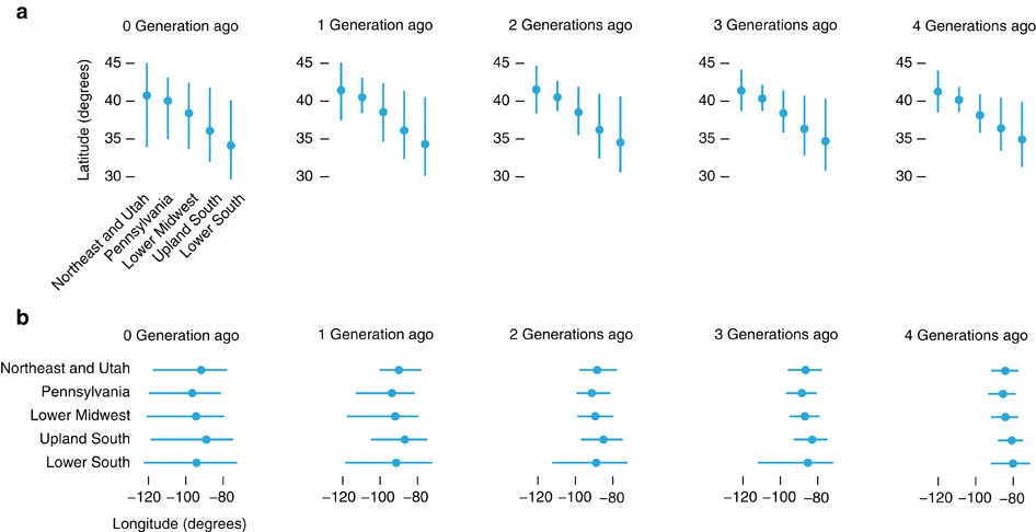
With this map above we also get these charts showing mean locations for pedigree reports for each major group for hte last few generations. We can clearly see that even four generations ago, each group was heavily vertically stratified, and remains so to this day, but which has dispersed slightly as time went on; apparently “Go West Young Man” was taken as a maxim. Longitudinally, we can trace a clear western migration through the moving of the mean longitude and a dispersal through the movement of the horizontal bars. Now we have a time element for these migrations: coastal Southerners spread quickly along the Gulf Coast. One generation ago there was a great spreading across the country, possibly as historical populations centers and cities became unliveable.
Hidden in the Supplementary Material are the following spectral embedding analyses. These show divergence of each specialty cluster from the rest of the dataset, for example we can see the divergence of both Puerto Ricans and Jews from the main cluster. In figure (g) you can see a small divergence of Appalachistanis from the main genetic body. We can see that, for example, Northeast Mexicans and New Mexicans share some affinity, but are still dinstinct, possibly convergin in the Spanish Nuevomexicano population still living in New Mexico, which we will see later; or that Hawaiians and Colombians are about as divergent as possible. See how Acadians are contiguous with French Canadians.


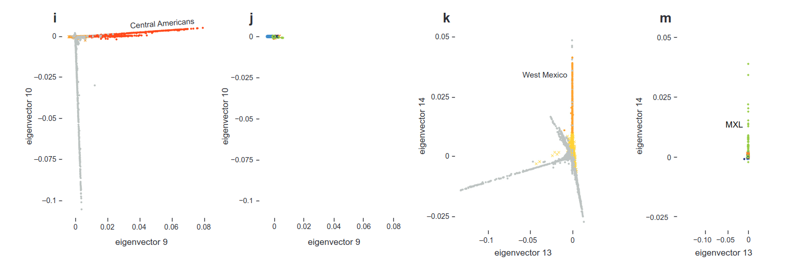

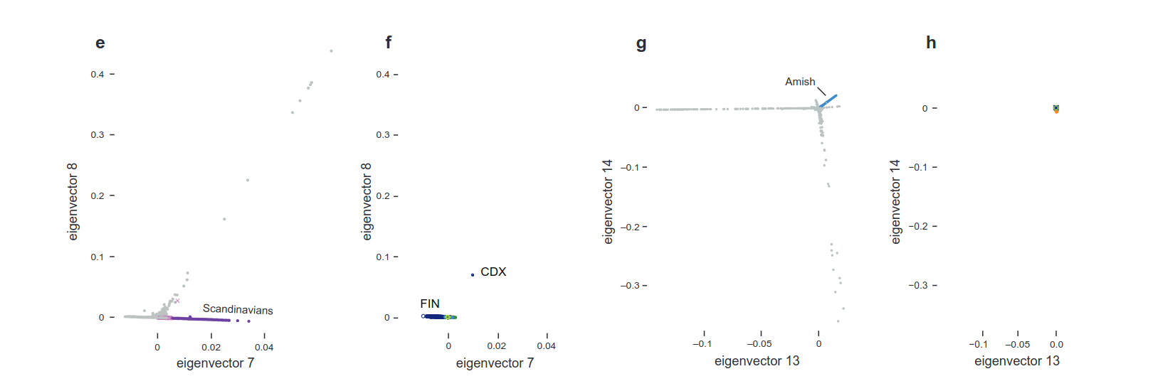
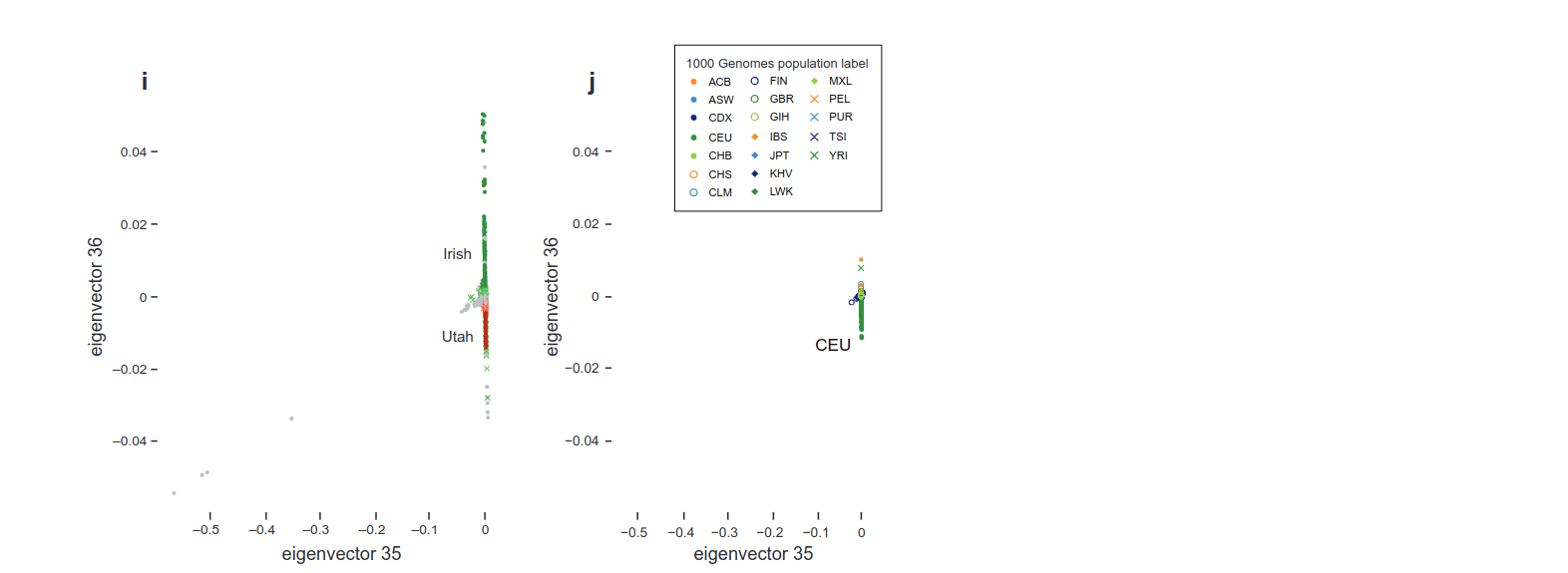
Notice also that Irish, Scandinavian, Mennonites, Amish etc. are separated in the table above and in the spectral embedding. Why is that? I thought Irish and Amish would be contiguous with mainline Americans? It’s not because they don’t make up a component of the American Race, but because in some areas they’ve remained so isolated it’s possible to draw them out from other clusters, as they are in these charts. See how we can draw out Utah Mormons from the mainline population in the same way, due to their isolation. These spectral analysis charts show how differentiated from the mean each ethnos goes: Jews and Africans are very distinct from Americans, while Scandinavians, Amish, Irish, and Mormons are distinct but not very divergent, most likely due to similar origin populations.
Genetic Origins
But Americans like to know their origins in the Old World. Let’s see some global admixture data on the groups presented here. See the column below ‘Global Admixture’ and see that most of the American population groups at the bottom are simply ‘Western European’. Specialty groups like Irish, Portuguese, Scandinavians can be pinned down to precise regions in Europe, but average Americans cannot be located so precisely. Later we will look into more finely grained origin maps to see exactly the regions in Europe that contribute admixture to the American genome.

But what is Western Europe here? How defined? Luckily the researchers provide us an answer in this map. It covers Madrid to Warsaw, and a sliver of southern England to include an English sample in that region. ‘Great Britain’ encloses all of the Netherlands and most of northern France, half of Ireland. Clearly these are genetic regions, not strict political borders, to account for similarities between neighbors, ancient migrations, etc. Thankfully in the Supplementary Material, they give us additional maps in fine geographic detail, which we will review later.


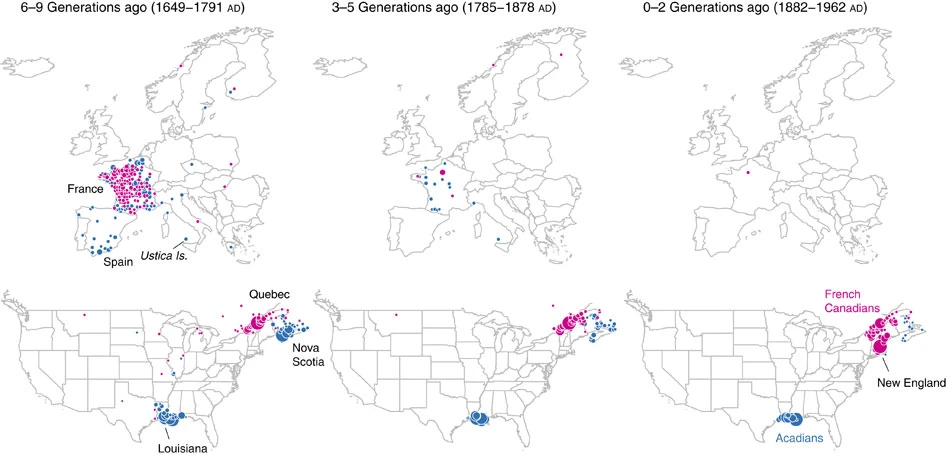
Now, we are about to dive into a long series of maps going into extreme detail on the migratory patterns of these American sub-races. First, following the researchers, let’s examine a sub-race as practice: Cajuns, Acadians, and French Canadians. Blue dots are ancestors of modern Acadians/Cajuns, and magenta dots show ancestors of French Canadians/Québécois. See here how many Cajuns and Acadians list their ancestors from 1649 - 1791 as being born still in France, alongside those in Louisiana and French Canada. 1791, of course, is the year that Britain established Lower Canada, which combined with the pressure of the French Revolution and the attractiveness of the new continent, spurred the settlement of Quebec. By 1878 we see most French Canadians had already arrived, and by 1962 many had moved to New England as well. Notice how between the 6-9th generations and the 3-5th generations, the large collection of blue dots had moved from Nova Scotia to Louisiana. This is due to the British expulsion the Acadians from Nova Scotia, after which they took refuge in Louisiana. Notice that Cajun Louisiana does not show migration into the rest of the South, nor vice versa. French Louisiana has been an ethnic enclave for a long time.
Now here’s a map depicting the same thing for the entire American continent. You can see that at Generation 0 (the ones who participated in the DNA test), they coalesce around cities, but their parents fill out the countryside, as do their grandparents and great-grandparents. From nine generations ago to four generations ago, we have Manifest Destiny, a clear western migration over the centuries. But between four and three generations ago, corresponding to the announcement of the close of the American frontier, we see that westward settlement largely ceases.

Those are the American ancestors. But since many of America’s White ancestors came asynchronously over the last three centuries, the researchers also created a map of ancestral birthplaces in Europe based on Ancestry.com pedigree reporting. You can see that the English, Scotch, and Irish were always coming to America for the country’s entire history, Continental French and German immigration largely dried up two generations ago. But in the country’s earlier days, there was massive immigration from all Western European countries (save Spain, who had their own hispanohablante countries to move to). French immigration seemingly slowed to a halt around five generations ago.

We can also go into specific ancestries of the five major sub-races, and later of the smaller genetic clusters. Let’s begin with Pennsylvania, the Mid-Atlantic strain. But in these maps the odds-ratio (OR) becomes more significant, so it is worth making sure all readers understand what this value means. The dots are colored according to their odds ratio, which shows “the proportion of ancestral birth locations [reported by] cluster members at that map location over the proportion [reported by] non-cluster members at the same location.” So if you see a blue dot in Middle Pennsylvania, indicating a high OR for that cluster, it does not mean that that geographical area of PA is the main contributor of admixture to the Pennsylvania cluster, but that the people born in that location will more likely show up exclusively in the PA cluster, and not in other clusters. And people born elsewhere are less likely to appear in the Pennsylvania cluster. When dots get smaller in size, it shows a smaller OR value, indicating that people from that area can belong to one cluster or the other in almost equal proportions. Britain, for example, has large dots here, indicating a large contribution to the PA admixture. But other clusters also report British ancestry, so the dots are not exclusive to PA, which prevents them from being red.
However, we know that early in Pennsylvania’s history, it was settled by large numbers of Germans (50,000 settled in 1760 alone). This is reflected in Germany’s large dots (lots of ancestral birthplaces) and relatively high OR value (the ancestors born there went largely to PA). The Pennsylvanian race comes primarily from Britain and Germany, and secondly from around Western and Northern Europe.

Let’s examine the Northeast and Utah cluster. There are actually two maps here: one centered on New England, and one on Utah. New England shows large migrations from Britain, Ireland, and Germany, but also that many of the immigrants from all over Europe came to N.E. alone. As expected, because people weren’t migrating to Lexington or Savannah, but to New York or Boston, or somewhere near those cities. For example, the red dots in Norway indicate that many Norweigian immigrants now cluster with the Northeast group, which is reflected in both New York and the obscure Norweigian communities of Passaic and Sussex county New Jersey. (We will see later about Norweigian migration to the Midwest, in which more of Norway is shown with high OR. What we see here seems to be exclusive immigration from certain villages, likely following family). The Northeast, then, after receiving waves of immigration into its cities, is a wide mixture of all Europe.
Utah is a different story. The Utahians report their ancestry coming from New England, England proper, and Denmark. Few came directly from England to Utah, but rather represent the last holdout of the ethnically pure English populations of colonial New England. Utah and its Danish component will be revisited later as we review enclave races.


For the following regions, unless otherwise stated, they derive ancestry from those six colonial nations listed above: England, Germany, Scotland, Ireland, France, the Netherlands.

The South as a Whole
Most Southerners only trace their ancestry to other parts of the South, not to Europe. This indicates that the South was not a destination of later European migrants, but remained the home of the original colonists, although you can see that some Mid-Atlantic colonists are represented here. In Europe they trace broadly across the continent.

The Upper South
This region encompasses the westward expansion of Virginia into Tennessee, across Arkansas and Oklahoma, and into Texas. They again primarily trace ancestry to themselves, but unlike the Lower South we see moderate immigration from the six European nations and from across the US. Many from the Western Carolinas still live along this path.

The Lower South
From the coastal Carolinas, these settlers swept along Florida, Alabama, and Mississippi into Eastern Texas. In 1814, the Creek Indians were expelled or forced to give up land, the opening-up of this territory and “Alabama Fever” gripped many South Carolinans which caused them to move in. A similar migration occurred in 1820-30s Georgia and Florida when Indians were expelled and Whites took their place. Notice again the separation between Anglo Louisiana and French Louisiana.

Appalachia
Most Appalachians trace their ancestry only to Appalachia, showing great insulation (whom I call Appalachistani‘s for their lack of outside admixture). Those who go to the Appalachians, evidently stay there, with some dispersion around the Lower Midwest. This region forms almost an ethnostate centered around the Cumberland Mountains.

Before we leave the South, we also are given maps showing how each of these regions expanded from the original colonies into the American continent, in even greater detail than we’ve seen so far.


We will now delve into the smaller and more exclusive micro-races of the United States. Some are noticeable, some are hidden; some try to maintain an ethnostate, some are isolated by lifestyle alone. Either way, they are identifiably different from the five main sub-races.
Mormons
Perhaps the best known group, those settlers which formed a new religion and set off to Utah are still the prime inhabitants of that western land. Additionally, a large number of Mormons descend from (mainly Midland and West) England, Scotland around Edinburgh, and from Denmark. Most Danes migrated exclusively into Mormon communities and nowhere else in the US.

We can also trace the movement of the Mormons through maps like the one below, which shows where the ancestors of modern Mormons were born generations ago. Overall, Mormons are members of the old New England sub-race, but simply isolated out west, insulated by both religion/lifestyle and geography.

The Amish
The Amish of PA, NY, and OH, primarily trace their heritage to those same states (very heavily to certain areas), but also to Western Germany and Switzerland, as Amish people themselves will tell you of their Swiss heritage, genetically and in their religious traditions. In fact, it seems like all immigrants from near Bern, Switzerland became Amish. The discrete nature of their settlements in America (i.e. Amish people tested report parentage from only specific communities) belies their peculiar rural lifestyle.

The Irish
The Irish have dispersed most heavily around the Northeast, but in some areas they remained so overwhelming that they are still detectable, as in Chicago and in Nova Scotia. In other places, like Massachusetts, they’ve assimilated quite well with other Whites. You can see a number of Irish, or perhaps we should include the Scots by saying “Gaelic”, related people in Nove Scotia as well due to British colonization of the island in the colonial era.

In fact, this study breaks down the American spread of Irish genes by region of Ireland: North, South, and West. The result, though, is a quite even spread regardless of region.


Of course, the Vikings of the Midwest. Almost all settlers from Norway, Finland, Poland and most from Sweden, went straight to Wisconsin, Minnesota, and North Dakota, along with some settling in the more developed Northeast as mentioned earlier. It appears that Scandinavian supremacy is so complete in that part of the Midwest that Minnesota is simply Norse clay, and Iowa may be Swedish clay too. The red dots show that few other ethnicities exist there.


Nuevos Mexicanos
Descended from the European Spanish settlers of New Mexico territory, this enclave makes up the primary ancestry of New Mexican ethnos. These are not Mexicans, but have been here since the Spanish settlement along the Camino Real de Tierra Adentro trail since 1598, which you can actually trace based on the settlement pattern shown below.


Mennonites
This sparse community began through homesteading on the Great Plains in the 1800s, and now find themselves centered around Kansas, Oklahoma, and Nebraska. They come England, Scotland, Germany, and exclusively from East Germany and parts of Sweden.

French Canadians and Acadians
Though this group was our example, it is worth revisiting them. The piece of Quebec attached to NE is occupied by Frenchmen of every region, from the English Channel to the Mediterranean. Acadians are those French of Nova Scotia and Louisiana. They hold all of Southern LA, and the southern tips of MS and AL.


Appalachians
Even though we’ve already seen the Cumberland Appalachians, the researchers bring them up again because they stand out at every level of detail as a total ethnostate. They report almost no ancestry anywhere but within Appalachia or the Chesapeake Bay, even 9 generations back.

Scots
Separate from the Scotch-Irish of Appalachia and the Highland Scots elsewhere in America, the Scots as a cluster show up linked to Nova Scotia and the Atlantic Islands in Canada, along with the Toronto area of Canada.

Italians
The famous Italians of NY/NJ. The Italians have not spread far, regardless of region of origin they have mostly stayed in the New York City area or in nearby states of the Northeast.

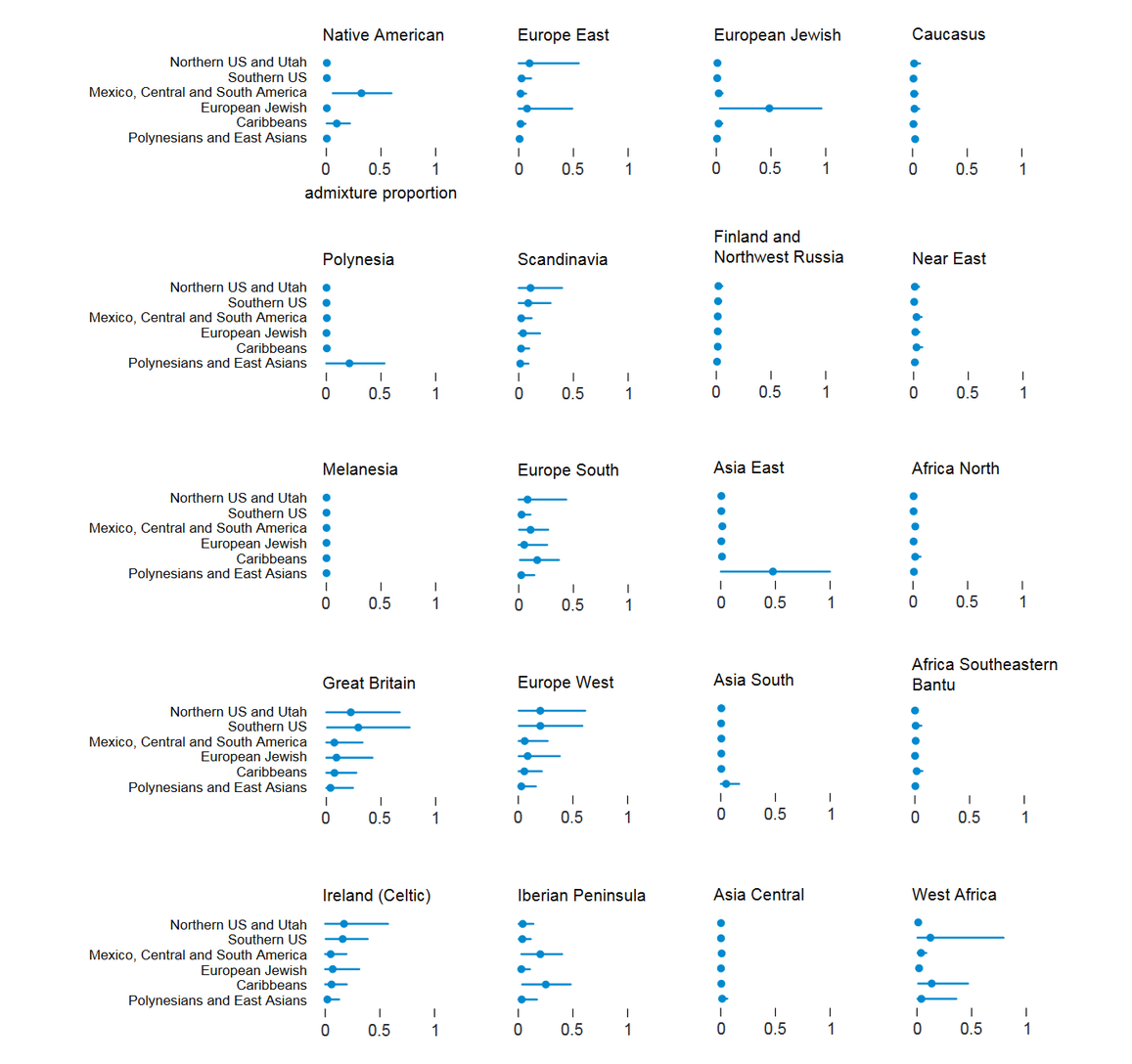
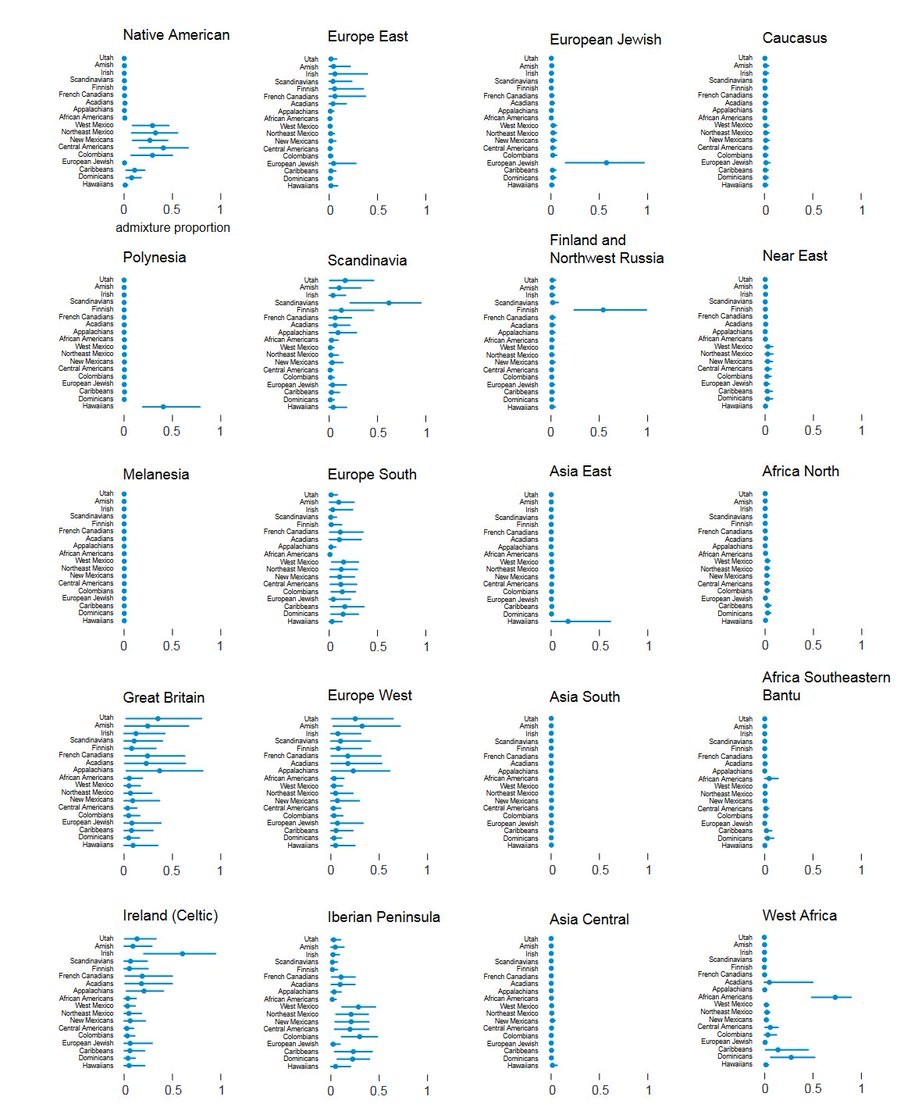
Finally, we are given admixture analyses for all groups at all levels of detail. You can see that for White Americans, admixture comes from Britain, Ireland, Scandinavia, and Western Europe. The insinuation that some people make that Whites all have a black or Indian ancestor is a lie.

Conclusion
I truly recommend coming back to the three charts above to prove or disprove any racial admixture in the American population, they’re quite good. And once again I urge you to read the paper itself, either to get a better understanding of the results, or to find one of the many extra groups in the Supplementary Material which I haven’t covered. We’ve discussed a lot of smaller races, but again I’d like to reiterate that, as shown above, the predominant substrate in American Whites is England, Wales, Scotland. Secondary admixtures: Irish, German, Scandinavian, French. Many people who came over after the Revolution were of the same original race as the earliest settlers, and blended in completely in a short time. I personally don’t take “length of time in America” as a determinant factor towards Americanness from a genetics standpoint.
Fin

Originally Posted to Twitter.